Why would you like to see the University of Pittsburgh's football team revert back to the old Pitt script uniforms?
First, let me get this on the table - it’s what the new recruits, commits, current players and fans want ... this isn’t about me. I’m just a voice for the cause. There is no better time to do it than now, quite honestly. The stars are aligned. We have a new coach, a new conference (ACC), and new high-profile players, commits, and recruits who believe in the football program.
Secondly, the Pitt Script “is” Pitt’s identity locally and nationally - it’s what we associate Pitt football with. Pitt’s greatest memories are with the Script; a #1 National Ranking, nine Heisman Finalists (one winner in Tony Dorsett), five retired jersey’s and 33 First-team All Americans to name a few.
What would be some advantages of Pitt returning to the classic uniforms?
The Script will:
• Generate new revenue streams, especially in merchandise
• Increased fan-base exposure locally and nationally (think Oregon)
• Signify a new beginning, innovative thinking, and staying relevant with today’s sports culture
• Give Pitt a unique logo, identity, and colors (brighter colors with the Script)
There’s an old saying, “look good, feel good, play good!”
Do you think there is any disadvantage if Pitt goes back to script?
Unequivocally and absolutely NO.
What or who do you think is preventing pitt from reverting back to the traditional brand?
Steve Pederson (from what I hear). But honestly, I don’t know. Maybe Pitt Administration and Marketing thinks that it’s too expensive to do this, but I’m not proposing a complete University re-brand and expense. They can keep all University marketing separate and just invest in the “Script” for Athletics ... and eventually roll out into other University items as needed. It’s not a big universal cost.
What are your thoughts about the current logo and colors Pitt is wearing now?
Just to clarify, people shouldn’t take my answers the wrong way, because I love Pitt. I’m a huge fan and have lived in Pittsburgh my entire life and I respect the effort from everyone involved in the current brand and all players who wore the current uniforms. My responses are objective from a design/marketing standpoint only. I’m fusing my passion for sports with my creative design background into this effort.
 |
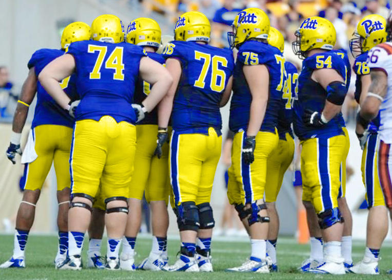
| Original photo |
 |
| Edited photo with "Script" colors/logos |
Not only do Pitt fans want it back, but I’ve had numerous Penn State and West Virginia fans (who strongly dislike Pitt) tell me that when they think of Pitt, it’s definitely with the “Script.” They say, “there’s nothing unique about our current logo and the gold color is dreary and dark.” It’s hard not to disagree with them.
How do you go about creating your uniform designs that you post online? Is it more than basic Photoshop?
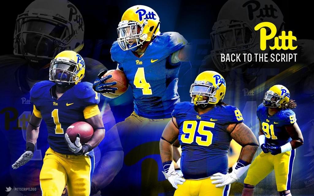
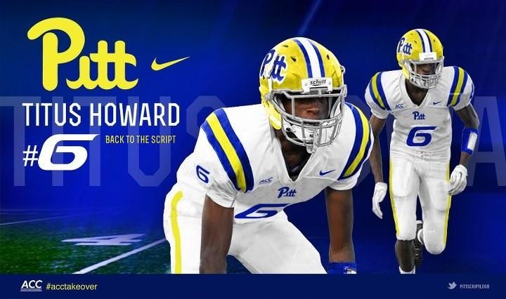
A lot of Photoshop involved and creative planning. It’s not just the uniforms I’m doing - I’m also creating desktop wallpapers and posters to give each player their own sense of “brand player endorsements” as NIKE does with all of their endorsements. I’m doing it to also get new football commits excited about being part of the Pitt family... they can actually see themselves in uniform well before they even graduate High School.
How were you able to get Pitt players to use your custom made uniforms designs in their twitter avatars?
 |
| Rushel Shell's Twitter profile picture |
You have an online petition for this cause, how is that going for you?
I’ve had great reaction and response. I’m over 300+ signed online. It has generated great interest from students and fans to do their own petitioning and research on campus and at tailgates to get the Script back and help support my effort. I also have a Facebook page in addition to a Twitter account. My Facebook is www.facebook.com/PittScriptLogo and my Twitter is @pittscriptlogo.
What is your game plan now? What are you doing to help Pitt get back to the script?
I’ve reached out to Pitt Marketing Staff (via Twitter) and a lot of Alumni who have connections have contacted me in efforts to speak to Administration to make this a reality. The support has been overwhelming. I’m not on the Pitt Marketing staff, but would love to act as a consultant on this effort. I have 20+ years in brand/marketing experience and can infuse some great ideas moving forward.
What would you say to people that tell you that this is not important enough of a cause to worry about?
The recruits have spoken - this cause is for the “now.” If Pitt cares about it’s lifeblood in recruiting and it’s future as a forward-thinking football program, then this is truly critical. I mean that. After the reactions I’ve seen from new recruits, they expect it quite frankly ... it speaks to them and all fans. To borrow from NIKE, “Image is everything.” The timing is now for a refresh to go “Back to the Script.”
Lastly, and I need you to be honest, what is your gut feeling? Do we really have any hope or is this a lost cause?
If my effort is in vain, it will be a travesty. This goes beyond the uniforms ... it’s a culture shift, an mindset, an opportunity to build a brand that the University of Pittsburgh can leverage. A must-see football program that can sustain itself and drive student/fan attendance, boosters, revenue and support.
The time is now. Back to the Script.


The colors on these are completely wrong. It's a great logo, but that neon yellow is an eyesore. Check out the Dorsett/Majors II era jerseys for the proper color.
ReplyDeleteI'm all about returning to script, but more of a mustard yellow and a bit darker royal blue
ReplyDeleteIf you want to make a statement that might help make the push, I would recommend that you get all the students on campus to buy only throwback gear showing the old Pitt script. Also if we were to go back to the old style uni's, I think we must add a white helmet version.
ReplyDeleteThat's an excellent idea. Also the white helmet would be fresh to death, I like. jseh99921 for AD
ReplyDeleteI think these uniforms are perfect. You would know it was Pitt just by looking at them from a distance. Also, the yellow is the same as the dominant color at Hienz Field which would give us more of a connection to our home stadium.
ReplyDeleteI rarely do this, but I'm commenting. First off, cudos for the time someone has put into this. I'm in FULL support of the script. The time for change was well received, served the program well and helped the University of Pittsburgh shed some of the mid-90's problems. The fact is money, money, money..... and judging by sales that time isn't NOW it was years ago. The "Throwback" merchandise consistantly outsells the new merchandise, with the limitation that the University is locked in to a logo, colors, etc.
ReplyDeletePlease bring back the script Pitt uniforms worn by the 1981-82 football team. Those are classic!!!
ReplyDelete